Huawei Mate 20 RS Porsche Design Complete Walkthrough: What a $2000 Phone Feels Like
Huawei just released a cacophony of phones this week–four in total, actually. And since they were kind enough to send me to London for the launch event and give me some time with each, I figured I’d try and do a complete walkthrough for you guys. In this video, let’s check out the easily most expensive phone they released: the Huawei Mate 20 RS Porsche Design.
If you aren’t familiar, a complete walkthrough on my site is where I try and go through every feature I can, test what I can, etc. so you guys are more prepared should you be in the market to go buy one.
Now, if you watched my walkthrough on the Mate 20 Pro, there is going to be a lot of similarities here since it has the same specs for the most part, but here we go.
Design
With that said, there’s a lot to go through on this fancy phone, so let’s get started with, potentially the most important part of this particular device–the design.
From the front, you’d have a hard time distinguishing the Porsche Design from the regular Mate 20 Pro. We have the same 6.39″ curved OLED 19.5:9 3120×1440 HDR display with, yes, a notch (that you can at least hide in the settings like you can on the Mate 20 Pro).
Moving to the back though is where it begins to differ.
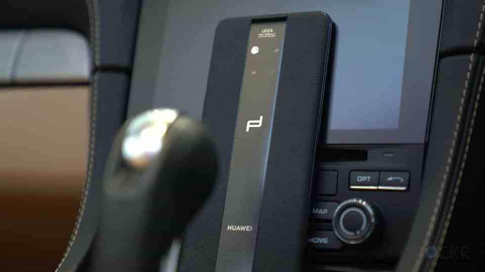
We have two colors for the Mate 20 RS: black and red (with red being exclusive to China only unfortunately cause I think it looks the best). The color is in the glass stripe down the middle that is meant to resemble Porsche racing stripes and in the handcrafted semi-aniline (meaning it has a light surface coating to keep it more durable) leather. While this is a very fancy look, it also does make holding the device a very unique, grippy experience in a world of all glass phones.
Another difference in the back of the device is that they’ve made the phone a hair thicker in order to remove the, albeit small, camera hump and make the entire back, flush.
Now, honestly, that’s kind of where the differences in the device design end. Porsche Design was only responsible for the chassis changes and so besides that back, it’s essentially a Mate 20 Pro.
The only spec difference we have is the fact it only comes with 8GBs of RAM and a choice of 256 or 512GBs of storage (whereas the Mate 20 Pro has a choice fo 6 or 8GBs of RAM but only 128 or 256GBs of storage).
Packaging-wise though, there are some other differences that I think are important to note are included given the price (which we’ll get to in a bit).
Inside, we have not one, but two of the 40W fast chargers. One with a UK outlet and one with a European one, because, you know, if you have the kind of money to spend on this phone, you travel a lot.
Then we have a case made of leather and plastic to match the leather on the device. When you put it on the device it recognizes it and adjusts the always on display to fit in the plastic window.
We also have the same headphones that the Mate 20 Pro comes with, some paperwork, and, of course, a little card ensuring you the phone is a limited design.
Now, for those not familiar with my video on Mate 20 Pro though, let’s go through the rest of the device.
On the left, we have nothing.
On the right, we have our different colored power button and our volume buttons.
On the top, we have an IR blaster that can be used with the included app to control TV’s, air conditioning units, and any other thing that has an IR receiver.
On the bottom, we have our USB-C port that can be used with Huawei’s Supercharge system that’ll get the device from 0-70% in 30 mins.
In addition to that, we have fast 15W Qi charging now.
And, Huawei added a fun party trick with their Qi charging ability just like they did with the Mate 20 Pro, as well. You can now, put any other Qi charging-capable device on the back of your Mate 20 RS and it’ll charge that device. Can you imagine topping up your friends iPhone XS with your phone?
And, you might have noticed, there doesn’t seem to be any speakers on the device. That’s because it uses the one in the earpiece and one inside the USB-C port. Also, something else clever, there is a dual SIM card slot that can use the SIM2 card slot for a new type of memory card called Nano-Memory apparently. It’s the same size as a Nano SIM but there is no word yet on the pricing or availability of this memory (if one of you guys knows, let everyone else know in the comments below).
The device is IP68 water resistant (so down to two meters for up to 30 mins).
It’s powered by the new Kirin 980 chipset that has a dual NPU for machine learning, an 8-core CPU that Huawei claims is 75% more powerful and 58% more power efficient, and a new GPU. And I think it feels snappier than the Mate 10 Pro or even the P20, for that matter.
Above the screen, we have that notch which is very similar to the iPhone’s notch. And there’s a reason for that; it has very similar sensors in it: an IR camera, a dot projector, a 24MP camera, flood, etc. So, of course, we now have 3D Face Unlock (as Huawei is calling it) which you can use to unlock the phone or even lock specific apps, etc. And it’s fast, for sure.
Besides that, we have an in-screen fingerprint scanner for those that would rather not use the face unlock. And, I have to say, this is a lot faster than the other ones I’ve ever used, thankfully, because the others were kinda slow. But it does require you to put your finger in a specific place that it’ll show with an icon but only after the screen is turned on.
And finally, we have 1.4Gbps LTE, WiFi 802.11ac that can supposedly hit 1.7Gbps thanks to new MIMO antennas perhaps, Bluetooth 5.0, and a massive 4200mah battery.
Software
For software, it’s running Android Pie with EMUI 9, Huawei’s custom user interface, running on top. Since it is similar to any other version of Android and especially any other EMUI device, I won’t go through every single piece of the software, but here’s the software Huawei and Porsche Design have installed and some of the bigger software changes.
Firstly, Porsche Design has added some themes that are exclusive to the Porsche Design devices to better match the outside of the device. There are 5 in total and they range from red to blue themes with various icon packs also in red and blue but some with hints of gold, as well.
Firstly, you can choose between the traditional Android software buttons at the bottom of the screen, or you use a gesture-based system. The gesture system lets you swipe from the left or right sides of the screen to go back, up from the bottom of the phone to go home, up from the bottom and hold it to get to multitasking, and up from a corner to get to Google Assistant.
You can choose between no app drawer and all your apps are on your home screen or, the more traditional, dotted icon to get to your app drawer.
We have our usual shortcuts in the notification shade that can be customized and swapped out for others.
And for included apps, we have:
- App Gallery: Huawei’s app store.
- Backup: App that lets you backup your device to the internal storage or an external device.
- Booking.com: Bloatware for booking.com
- Huawei Health: Huawei’s own health tracking app for steps, etc.
- HiCare: Huawei’s customer service app for support.
- Mirror: A weird app to let you use the device as a mirror (basically just opens the front-facing camera).
- Music: Huawei’s music app to play back music as well as buy new songs.
- Phone Clone: Let’s you copy all your apps and data from or to another device.
- Phone Manager: Let’s you monitor and adjust the performance, storage space, and battery usage.
- Recorder: Audio recording app.
- SIM Toolkit: An app to manage each of the dual SIMs.
- Smart Remote: The app to use the IR blaster I mentioned.
- Themes: Place to download or buy new themes/skins.
- Tips: An app to help you learn more about the device.
- Torch: Tapping this button turns on the LED as a flashlight.
- Microsoft Translator: A specialized version of the Microsoft Translator app that is optimized for the NPU in the Kirin chipset.
- Wallet: Huawei’s own version of Android Pay.
Camera
Now, on the back, we have our new three-camera system tuned by Leica that thankfully has lost the monochrome sensor in exchange for three different focal lengths (which I think is way more useful).
We have our same camera from the Huawei P20 Pro with 40MPs and an f1.8 aperture with a standard focal length that can pixel bin down to 10MP to get huge 2-micron sized pixels (for my video on why that camera was the best lowlight camera out, head here). Then we have the same telephoto from the P20 Pro which is a 3x optical zoom 8MP f2.4 lens that is optically stabilized thankfully instead of the 2x zoom which I personally like because it’s a bit more versatile than the 2x and gives more options for framing shots.
And finally, we have the new wide angle lens replacing the monochrome from Huawei P20 Pro, that is a 20MP f2.2 equivalent of the 16mm.
You can switch between the cameras using the same button at the bottom of the viewfinder to go from the 0.6x super-wide, to the normal angle, to the 3x optical telephoto, to the 5x software zoom.
Here are some camera samples from the Mate 20 Pro which has the same identical camera (follow me on Twitter, Instagram, and Facebook for more photos):
Now, inside the camera UI, we have:
- Huawei Lens: This shortcut to allow you to use their version of Google Lens that identifies items to search for shopping, images, etc.
- Flash: Flash options.
- Motion: Essentially Live Photo which takes a small clip before and after a photo is taken that can be played back in the gallery.
- Color: Select from Standard, Vivid, and Smooth coloring (which mimic Leica film stocks I’m told).
- Aperture: This allows you to mimic a faster aperture with a blurred background. This is similar to Portrait mode, but this will work on any object whereas Portrait is meant for people. You can also select between 1x, 2x, and 3x zoom.
- Portrait: Does the same blurred background trick as Aperture but will only work if it recognizes a face and also adds, a beautification feature to smooth skin (which I always find terrifying). We also have 3D Lighting Effects that can add stained glass reflections, shadows from blinds, and other cheesy lighting effects.
- Photo: The usual auto mode for taking photos. You can shoot from 18.8:9 aspect 6MP up to 4:3 in 40MP, but you lose the pixel binning that creates those larger pixels I mentioned, so I’d probably stick with 4:3 10MP unless you really just need more resolution and are in a bright area.
- Video: The usual auto mode for taking videos. You can shoot from 720P to 4K in 30fps.
- Pro: A mode that allows you to control various camera settings like ISO, Shutter Speed, etc.
- Food: Basically ups the saturation.
- Night: One of my favorite features from the P20 Pro has made it’s way to the Mate 20 Pro, night mode. This takes a long exposure shot then uses some software magic to overlay the different exposures over the image to create a crisper better exposed overall shot. Other devices can do something similar, but this is the only one I’ve found that can do such a long exposure and because of its software stabilization it can negate your handshake which normally would result in an image with streaks in it (even from a much more expensive camera).
- More: You can download other camera modes from the more button whenever more are available I imagine.
Then in the camera settings, we have:
- GPS Tag: Adds location metadata to the photo for organizational reasons.
- Add Watermark: Adds “Huawei Mate 20 Pro Leica Triple Camera AI” to the bottom left of every photo you take. Not sure why you’d want that but sure.
- Master AI: The usual AI camera helper we’re used to now that can recognize various scenes and automatically adjusts the camera settings for that scene. The new addition is that it can now also adjust to the different lenses based on what you’re shooting (i.e., switching automatically to the wide angle lens when it thinks you’re taking a photo of a landscape). I always turn this off on every phone as I find it never does what I want and frankly the addition of the switching lens “feature” is even more obnoxious in my opinion.
- Assistive Grid: Turn on different grids to help you line up shots in the frame (I always use the rule of thirds, personally).
- Mirror Reflection: Turns the camera view around, so it more resembles a mirror.
- Mute: Turns off the camera sounds (why you would ever want these on, I’m not sure).
- Timer: Choose between 3, 5 and 10-sec timers.
- Audio Control: Allows you to say cheese to take a photo or have it automatically take a photo when the noise around the phone gets to a certain decibel level.
- Capture Smiles: Have it automatically take a photo whenever it recognizes a smile in the photo.
- 4D Predictive Focus: This is actually a clever use of the AI on the device, I think. It can recognize the subject (i.e., a person, a dog, etc.) and automatically track that person with the autofocus and seems to be pretty accurate and fast in my quick time with it.
- Ultra Snapshot: You can choose whether you want to automatically take a photo when you double tap the power button, have it open the camera (my preferred setting), or do nothing.
Oh, there’s one more tiny detail that’s different about the Mate 20 RS over the Mate 20 Pro. The 8GB/256GB version is 1695 euros and the 8GB/512GB will set you back 2095 euros.
And yes, this is an insane price, but considering the Mate 10 RS that was released last year completely sold out, there is obviously a market for them. Even if I and I imagine a lot of you are not it. Regardless whether I would spend that kind of money to just be more unique, it definitely feels luxurious and completely different than anything else out right now and still has all the crazy features the Mate 20 Pro just brought to the table.
And there you go, guys. As much as I could squeeze into this video. I have to admit, it feels like Huawei just listened to all of us say what things we liked in other phones and just threw them all into this phone. I’m not gonna lie, kinda excited to try it out.
Follow me on Instagram, Facebook, and Twitter (@theunlockr) for photos from the device coming ASAP and subscribe for more videos if you aren’t already and make sure to check the bell next to the word subscribe so you get notified about new videos and let me know what you guys think about this phone in the comments below. Thanks for reading.


Who in their right mind would pay 2k for a phone ? There must be a lot of wealthy Chinese.
There’s a lot of wealthy people. Period. Lol