Skagen Falster 3 Complete Walkthrough: The Best Looking WearOS Watch Gets More Functional
The new Skagen Falster 3 showed up this week and, I’m not going to lie, I’m excited for a new Falster.
You see, the Skagen Falster is arguably one of the best looking WearOS watches, not just in my eyes, but apparently to a lot of people.
So naturally, when a new one comes out and it keeps that minimalistic style but upgrades the functionality, it’s generally a recipe for success.
So really quick, let’s do a complete walkthrough on it. If you’re not familiar, a complete walkthrough on this channel is where I try and go through every feature I can on a new device so you are better prepared should you be in the market to go buy one.
Hardware
With that said, there’s a lot to go through, so let’s get started with the hardware.
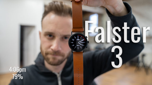
Firstly, we have one case size of 42mm with a 1.3″ AMOLED round screen in the middle. It’s made out of stainless steel and comes in three colors.

There’s a black case that comes with a brown leather band, a silver case that comes with a blue mesh silicon band, and a slightly darker silver case that comes with a metal gauge mesh band.
Focus on the case color though when you’re choosing one because just like previous models, the bands are interchangeable. You can either buy them from Skagen or just search Amazon for any 22mm straps that are quick release and those will work, too.
Now, I’ve always been a fan of Fossil smartwatches (and their subsidiary companies like Skagen) because of the simplistic and minimalistic style. They’re slim, clean-looking, and lightweight and the new Skagen Falster 3 is no different.

In fact, as with a lot of the smartwatches from the companies in the Fossil group, the Falster 3 is actually a redesign of another Fossil watch–in this case, the Fossil Watch Gen 5 (which you can check out my walkthrough on that here if interested and if you already watched it, I apologize now for the fact that some of this video will sound like a repeat from that one then).
That’s because it has basically the same specs, but, at least, is impressively squeezed into a smaller design (42mm vs 44 for the case size and 11mm instead of 12mm for the thickness with a 1.3″ screen instead of 1.28″). And while both are minimalistic in their look, you would choose the Gen 5 or the Skagen based on the slightly different design each has.

This new watch is also swim-proof up to 3 ATMs (or 3x normal atmospheric pressure). That is slightly less than the 5 ATM we’re used to seeing but still plenty enough for doing laps or going for a swim if you ask me and they even now have a speaker included (something the Falster 2 watches didn’t have).

You can use that speaker to make phone calls (although I always think this is a weird look, but maybe that’s me). And thanks to the fact that they ported over some of their pretty useful software from the Fossil Gen 5, you can also make calls on the watch and some use some other features while connected to an iPhone, as well.
We have two push buttons (that will dive into more of what they do in a sec) and a third middle one that is also a turnable crown that you can use to more easily navigate things on the screen.
For sensors, we have a heart rate monitor that can be used with Google Fit (it’ll even take your heart rate automatically every 20 mins or you can tap the heart icon to have it take it manually).
We also have NFC so you can tap your watch to a terminal to pay using your Google Pay or similar account. We have GPS built-in, an altimeter, accelerometer, gyroscope, ambient light sensor, and a microphone, too.

Powering the watch is the Qualcomm Snapdragon Wear 3100 chipset that was released a bit ago as a WearOS specific chipset.
That is paired with 1GB of RAM and 8GBs of internal storage (double that of the Falster 2). The storage allows you to download songs to the device, for example, so you can play music from it via Bluetooth without needing to bring your phone with you.
For battery, it has a fast-charging capable one and can apparently get the Skagen Falster 3 to 80% in about 50 mins. Subscribe for my real-world test video on it coming soon that I’ll test just how long that battery actually lasts. I
Software
Now, for software, we are running the latest version of WearOS so any other WearOS watch is going to work very similarly. If you aren’t familiar though, I’ll quickly run through the basics.

When you wake the watch you’ll be greeted by your chosen watch face which sort of acts as your home screen. You can tap and hold on this screen to get to all the watch faces you currently have installed and swipe between them to choose a different one.
You can also tap the gear icon under any of these to be able to customize that watch face. Each watch face has its own options; think adding widgets for your upcoming events, shortcuts to workouts, etc.

Swiping over to the left gives you your Google Assistant section that you can tap to talk to the assistant like you would your phone (and you can hold down the crown button for a shortcut to that instead, as well) and scroll through to see upcoming cards for events, traffic, etc. like on your phone, too.

Swiping down from the top brings you to your quick settings to turn on and off various items, control your music from, etc. and if you swipe down further you can tap the gear icon to get into all the watch’s settings.
Swiping to the right brings you to the newer Tiles section. You can continue to swipe to the right to get to each of the tiles that range from Google Fit, to the weather, to your upcoming events, news headlines, etc. (and you can tap and hold in here to customize them).

Swiping up from the bottom gives you the big reason I use smartwatches for: notifications.
You can then swipe any of them away to dismiss them or tap on them to expand them and be given more options to interact with them (reply with canned responses, swipe on the keyboard or talk to the watch to compose a message, archive an email, etc.).
Pushing in the crown while on the watch face will bring you to your installed apps (and you can tap and hold on any of them to pin them to the top of the list). Otherwise pushing the crown on any other screen will bring you back to the watch face.
Swiping to the right on any screen will take you back to the previous one.

And, finally, you can customize what apps you want the other two buttons to launch when they are pressed as well.
Now, again, all of that is very standard fare for WearOS and will be the same for the most part across any WearOS-enabled watch, but Fossil did add a few extra features using their own software: namely the better iPhone integration I mentioned and a collection of Extended Battery Modes.
The concept behind the battery modes is that you can choose from three different options to adjust how the watch uses the battery (and thereby hopefully extending it beyond WearOS’s traditionally not great runtime).
By swiping down from the top of the watch you can then tap on the battery icon and choose from the following:

- Daily Mode: Essentially, let’s all the features work and is the default mode.
- Extended Mode: Disables always on display, turns off touch/tilt to wake, turns off wifi and the speaker, and disables OK, Google hotword detection but still leaves notifications, heart-rate and everything else running normally. Frankly, the mode I would probably put the watch in myself.
- Time Only: Does what you think. Limits the watch to only be able to tell the time and thereby increase battery life for up to a week supposedly.
Conclusion
The new watch costs $295 and here’s a link to the best price I could find on it. Stay tuned for my real-world test coming ASAP and be sure to subscribe and ding the bell next to the word subscribe so you don’t miss that. Also, let me know in the comments below what you guys think of the watch, of this video, etc. always love hearing from you guys and as always, thanks for watching!


